Kalorama Collective is a non-profit organisation. They create multiple services to assist their community and bring back warmth and togetherness after the storm in the early 2020s. The goal is to re-conceptualise the branding of Kalorama Collective, to bring more social media engagement and efficient recognition in their community.

CONCEPT

Development and Production

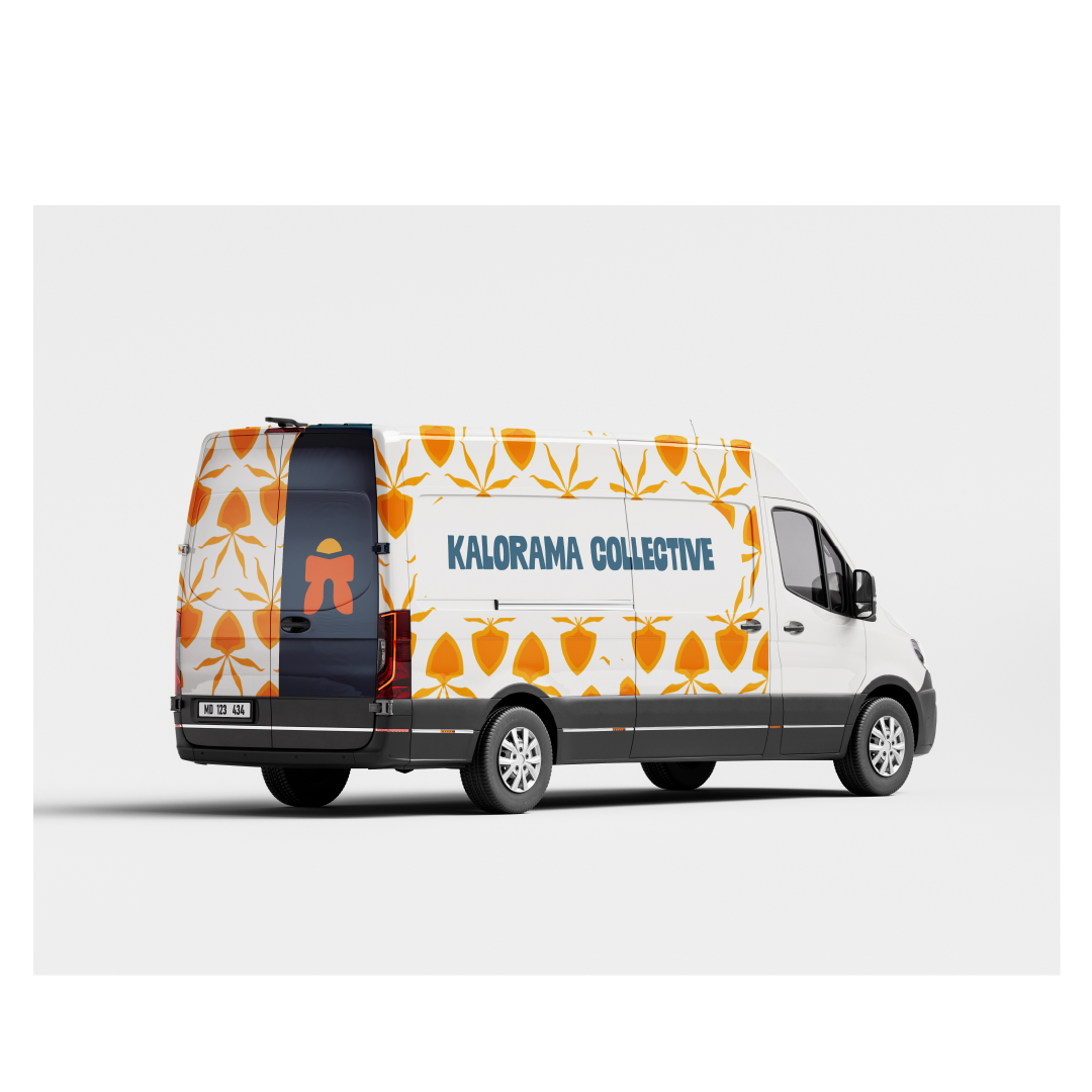
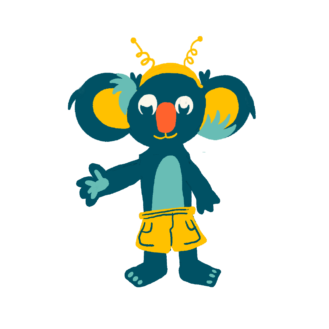
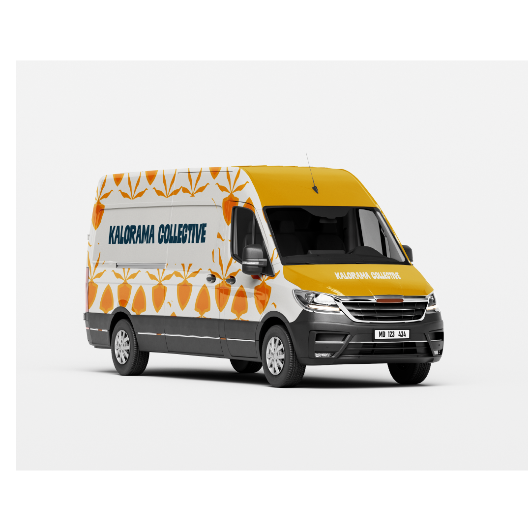
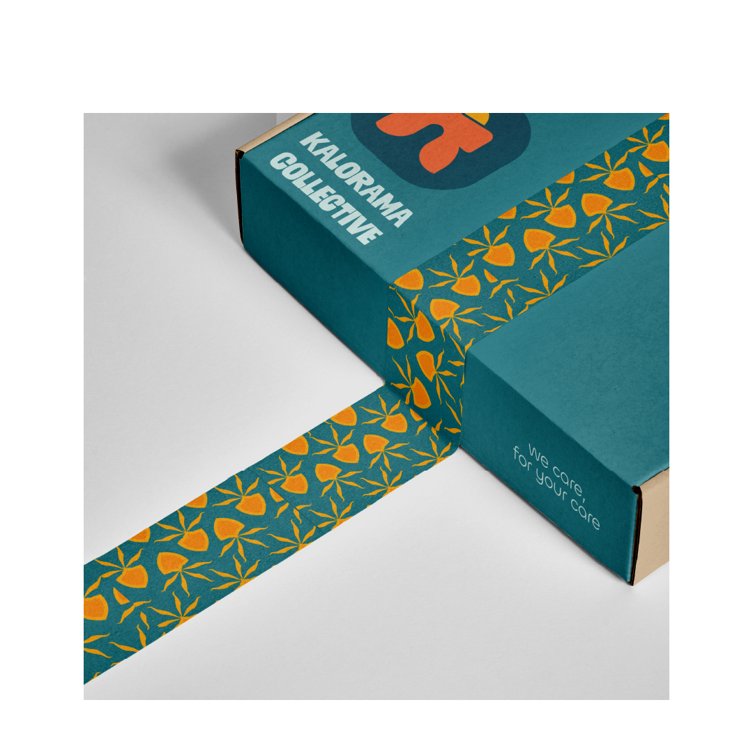
As Kalorama Collective thrives within the hands of its regional members, there is a demand for creating more family-friendly branding for ages 8 and above. To broaden the range of the community's social engagement, a guideline is made. Bright colours are chosen alongside a mascot to bring the idea to life.

Creating the concept was a challenge. It required plenty of research, mainly on inclusive methodologies for such a broad age. The only problem was the age gap. It took time to find the most "desired" preference of style, however all things aside, like the saying, it may not be "everyone's cup of tea".


BOX PACKAGING
MOBILE LIBRARY

The organisation shows different campaigns that bring people together. One of the ways to show a brand mark is through its unique packaging style. Using the Waratah flower, the pattern creates a distinctive look for Kalorama Collective.

case study link down here:

"Books to-go, please"

Kalorama Collective opens ways for the community to engage with one another. A mobile library was pitched to increase community gatherings and enhance educational purposes for all.

the making of ideas

The Collective organises a variety of activities, including workshops, social events, and collaborative projects. These activities are designed to bring people together, promote learning, and encourage actions that benefit both individuals and the broader community. The Kalorama Collective’s approach is deeply rooted in community engagement and sustainability, and they continue to develop new initiatives that align with their core values.

The koala, Bingo, was created to boost the liveliness of the brand. The mascot helps implement the three main colours through the 60-30-10 User Interface rule. Shown on its eyes, fur, and nose, Bingo was made to be that "open-minded" element on the brand mark.

Kalorama, the region, lies 40km East of Melbourne. The communities within this area take care of the diverse fauna and forms to create sustainable living. The pattern chosen for the brand is based on one of the most common flowers found in the region, the Waratah. The specimen grows with colourful attributes and forms in clusters during Spring time. Waratah represents the beauty of growing together in a community, the same as the core values within Kalorama Collective.


ndYsuara

ndysuara@gmail.com

@ndysuara